Picking a picture as the background.
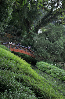
I've decided to use the view of the lake as my background. I edited the brightness, sharpness and the color of the photo above using photoshop.
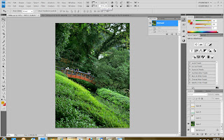
This is how the photo i picked looks like after editing with photoshop.
Step 2
I've decided to pick 4 pictures I've taken there to just give people a little "sneak peek" of the beautiful flora there. These are the 4 pictures I've chosen.
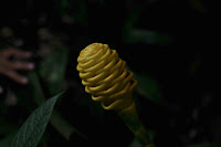
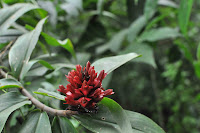
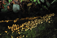
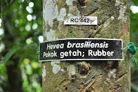
I edited the sharpness, color intensity and brightness of these photos.
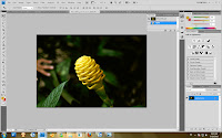
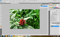
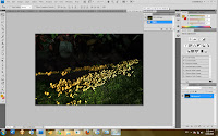
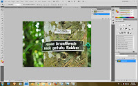
This is how they look like after editing
Step 3
I moved these 4 photos to the first picture, which is the view of the lake and resized them.
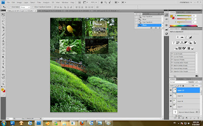
Step 4
I blurred the edges of the 4 small photos so that the images do not look like they appear suddenly but rather, they appear like they are fading in.
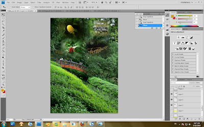
Step 5
I add text to the photo.
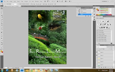
Step 6
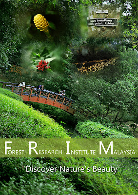
I add a bar across the word "Forest Research Institute Malaysia" to sort of highlight the text

Final
No comments:
Post a Comment